Data Sources, Data Cleaning and Exploration
Data Sources
The data used in this project is sourced from two organizations: The World Bank and
The African Development Bank Group.
Both organizations offer API access to their data. Most datasets were clean, only requiring data wrangling.
Since plots have been created using both R and Python, there are multiple data cleaning files, which are available for download at the bottom of this page.
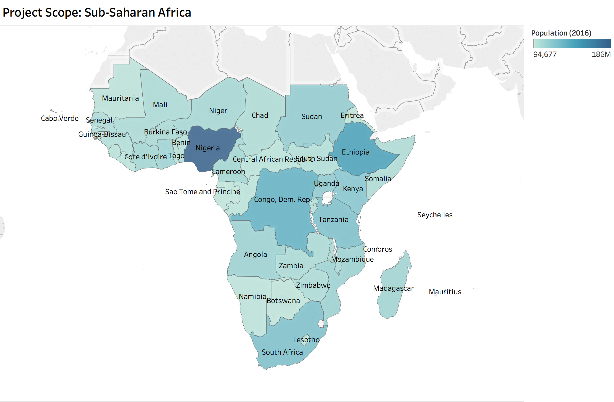
The project scope is Sub-Saharan Africa, so data was filtered to include just those 47 countries.
The map shows the countries colored by their 2016 population to illustrate.
The Sub-Saharan countries are geographically located in southern part of Africa.
They contrast with North Africa, whose territories, languages, and cultures are very close and like Arab world.
Therefore, we have decided to differentiate Sub-Saharan countries from North Africa and focus on Sub-Saharan countries.
Data Collection
R - In the R data cleaning file, data is accessed using an R library called
WDI (World Development Indicators)
that is a wrapper for the World Bank API. The R data cleaning file (Data_Cleaning.R) includes the following World Bank indicators:
GDP Growth, Inflation (measured by the GDP Deflator), Inflation (measured by CPI), Employment, and
Vulnerable Employment. The data was clean, except for a few "outliers" in the inflation data due to hyperinflation.
The second R data cleaning file (DataExploration_and_Cleaning.R) includes the following World Bank indicator: Share of GDP on Infrastructure
and the Infrastructure Index from The African Development Bank Group.
Python - For the Python file, data was collected from the World Bank API using the
wbdata library.
The indicators included in the Python data cleaning file (get_clean_data.py) are
GDP, GDP Growth, Population, Access to Electricity (%),
Access to Internet (%)
, and Cellphone Subscriptions (per 100).
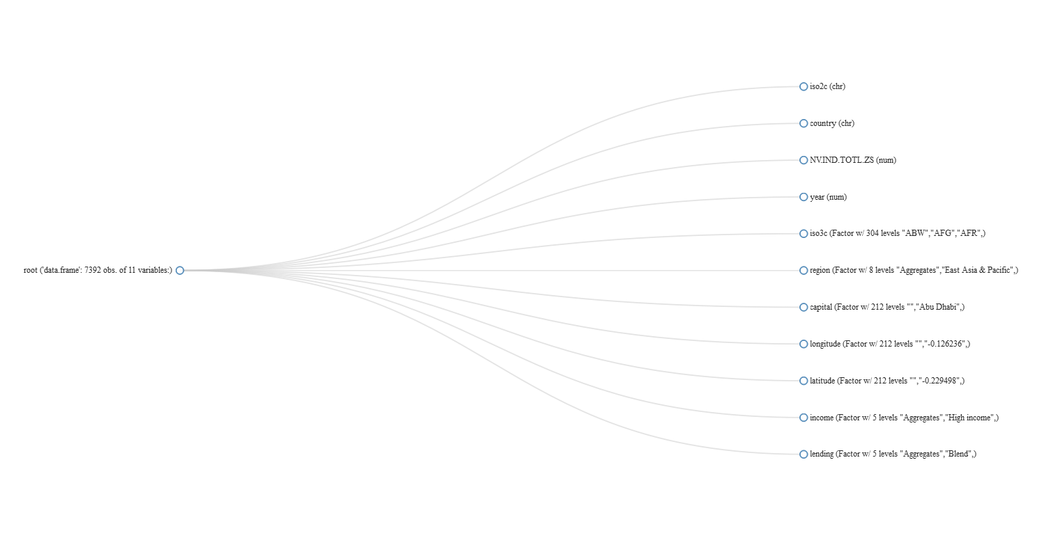
All datasets obtained from World Bank have a consistent format of the following variables: iso2c, country, indicator, year, iso3c,
region, capital, longitude, latitude, income, lending.
The data is filtered on the 3-digit-country code, iso3c, to focus on Sub-Saharan African countries.
The plot below shows a list of the World Bank data features.
Data Exploration
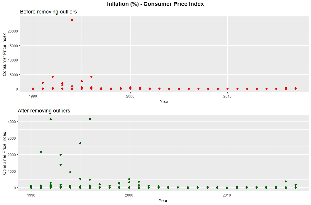
Inflation can be measured two ways, through the Consumer Price Index (CPI) and the GDP Deflator.
Due to periods of hyperinflation in some African countries, the data has outliers, which are removed for further processing.
For the CPI, one outlier was removed: Democratic Republic of Congo, 1994 (23,773%). The same process was repeated for the alternate measure of inflation,
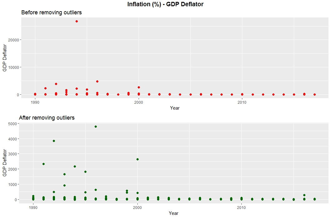
the GDP Deflator, as show in the below plot. The same outlier was removed: Democratic Republic of Congo, 1994 (26,766%).
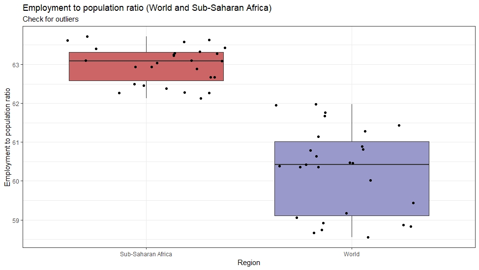
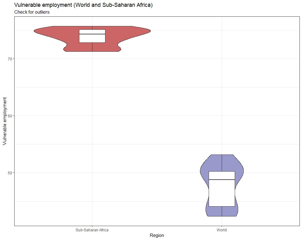
Both the Employment and Vulnerable Employment data was clean, without any outliers.
Sub-Saharan Africa has a higher level of employment, but also a higher level of vulnerable employment when compared to the World.
Additionally, the vulnerable employment data has a wider distribution in Sub-Saharan Africa than for the World.
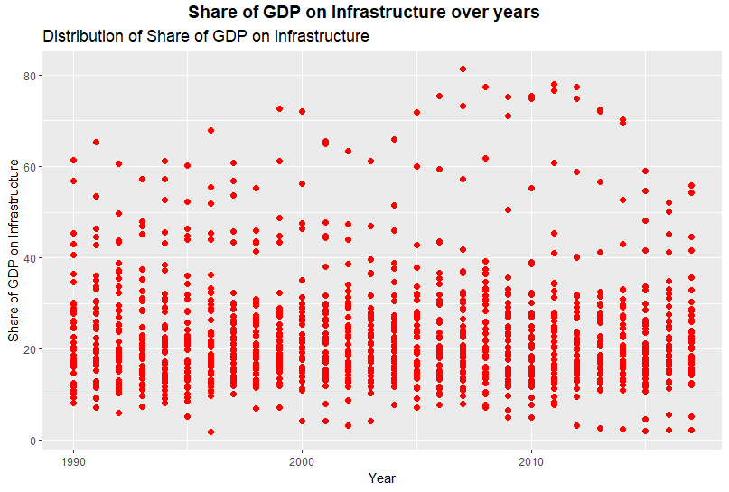
The distribution of Share of GDP on Infrastructure is shown below from 1990 to 2016. No outliers exist, as this data is an index.
This dataset is used to investigate the index of individual countries in certain years.
In this way, there can be deeper understanding of distribution of infrastructure investment.
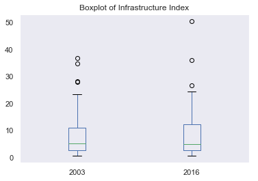
The following boxplot displays full range of variations of the Infrastructure Index in 2003 and 2016.
While the distributions remain similar, there exist more distinctive outliers in 2006 dataset.
This outlier can represent important part of the dataset, especially for understanding the complex continent of Africa contextually.
From the below pairplot, there is a positive correlation between Access to Electricity to both Access to Internet
and Cellphone Subscriptions. Additionally, Population and GDP are correlated.
Correlation coefficients were also determined to support the visual evidence.
The distribution of the infrastructure indicators are right-tailed, which indicates some disparity in the availability of those services by country.
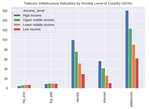
Countries are also grouped throughout this project by their Income Level, as designated by the World Bank.
The data was remapped to include this attribute, and is reflected in the pairplot below and throughout the project.
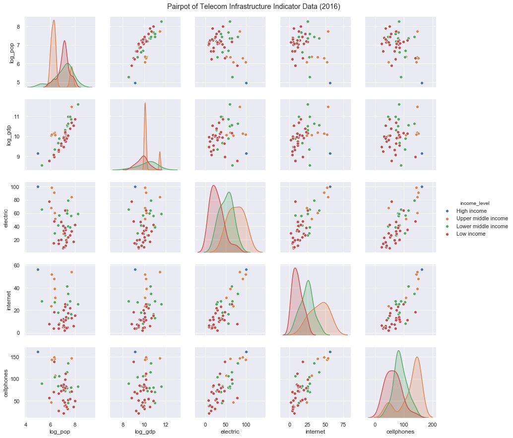
Indicators are higher for those countries designated as High or Upper middle income, as expected.
However, running an ANOVA 1-way test shows no significant difference in the infrastructure indicators (electric, internet, cellphones)
by the country's income level.
Finally, the data was also checked for missing values. Country names were cleaned to strip diacritics.
New variables were created to investigate growth rates.
In sum, this data was clean with very few missing values.
All scripts used in this project can be accessed below. Note that visualizations created in Tableau (maps, area chart, bubble chart)
will not be included in these files.
- Data Cleaning Files
- Data_Cleaning.R - Collects and cleans all data used in Section 1, creates EDA plots
- DataExploration_and_Cleaning.R - Collects and cleans all data used in Section 2, creates EDA plots
- part1_get_clean_data.py - Collects and cleans all data used in Section 3, creates EDA plots
- Viz Creation Files
- All_Viz.R - Creates line chart, circle view chart, and density chart in Section 1
- Make_Plots.R - Collects and cleans all data used in Section 3, creates EDA plots
- data_cleaning.py - Creates line chart in Section 2
- Make_Plots.py - Creates bar chart and density plot in Section 2
- part_1_make_plots.py - Creates pie chart and lollipop chart in Section 1, heatmaps and scatterplots in Section 3