More complex interactive visualizations were created to further explore the Twitter Data and Happiest States Data and identify any relationships between the tweet content and the known happiness of U.S. States.
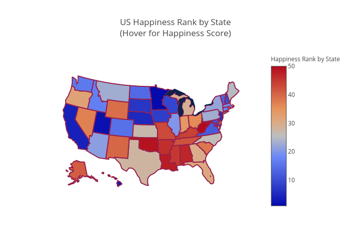
Plot.ly Map of Happiness Rank by State
Visual Analysis of Happiness Rankings
To visually investigate the geographic spread of WalletHub’s Happiness Rankings of U.S. states, the Happiness Ranks were plotted on a map of the United States, as shown above. States ranked as least happy are shown in deep red, with those ranked as happier portrayed in deep blue. As shown in the figure, there appear to be similarities by region – southeastern state tend to have the lowest happiness scores, while northern Midwestern states were reported to be most happy.
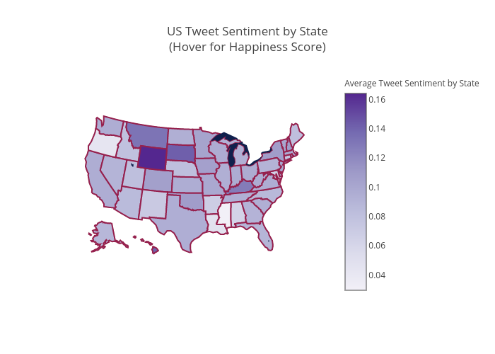
Plot.ly Map of Average Tweet Sentiment by State
Visual Analysis of Tweet Sentiment by State
Similarly to the above plot of Happiness Rankings of U.S. states, the compound sentiment of tweet content, averaged by U.S. state, was plotted on a map of the United States, as shown above. States with the most positive tweets, on average, are shown in deep purple, with those averaging as more negative portrayed in a lighter purple.
Although the differences in Tweet Sentiment by state are not as visually apparent as the Happiness Rankings, there appear to be similarities in the two figures. While there is not a strong correlation on a state-by-state level – specifically, the contrasting results for the state of Wyoming – it appears that there may be a strong relationship on a region-by-region level. When viewed as a whole, the southeastern states tend to have the least positive sentiment, on average. As with the Happiest States rankings, the collective northern Midwestern states are reported to be most happy. Based on the similarities between these two figures, there is potential that a relationship exists between the sentiment of tweet content and the happiness rankings of United States regions. Additionally, differences seen in states like Wyoming may be merely the result of the small sample size of tweets and relatively small population of the state.
Visual Analysis of Happiness Score by State
The red-blue diverging figure shown below is an interactive map of WalletHub’s Happiness Score by state. The happiness score is evaluated based on three key dimensions: 1) Emotional & Physical well-being, 2) Work environment, and 3) Community & Environment. The red region represents the state with low happiness score whereas the blue region represents the state with the high happiness score of the United States. Each state is graded on a 100-point scale, with a score of 100 representing maximum happiness.
Visual Analysis of Happiness Score Composition by State
We went further to explore the rank of each dimension of WalletHub’s Happiness Score to understand the variability of different dimensions of the score. Each blue, orange, and red bar of the figure below represent 1) Emotional & Physical well-being rank, 2) Work environment rank, and 3) Community & Environment rank respectively. This provides additional insight into the details behind the happiness scoring.
Visual Analysis of Proportions of Positive Tweets by State
To further discover the insights of Happiness Scores and Sentiments of Tweets, this time we use the proportions of tweets. To be more precise, we take the proportions of positive tweets and negative tweets over the total number of tweets and visualize these proportions on the map. We are assuming that higher proportion of positive tweets for a state indicate that this state is happier. Similarly, a higher proportion of negative tweets for a state indicate that this state is less happy. By mapping the proportions of each state, we are trying to visually find the connection between tweets’ sentiments and states’ happiness scores.

Shown above is a map of the Proportions of Positive Tweets, by State. From this map, we can see that the southeastern region of U.S. is lighter than other regions, which means that they have lowers proportions of positive tweets. Based on the Twitter Data, Twitter users from these regions have less happy tweet content. Looking back to the visual of happiness scores by state, the southeastern region does have lower happiness score than other regions (the states are in red). This suggests that there are similarities between the Proportions of Positive Tweets by State and the states’ known happiness score.
Visual Analysis of Proportions of Negative Tweets by State

Shown above is a map of the Proportion of Negative Tweets, by State. From this map, again, the southeastern region has darker colors than other regions, which means that they have higher proportions of negative tweets, thus less happy. This corresponds with what we have for the map of proportions of positive tweets, and the map of happiness scores.
Visual Analysis of Proportion of Super Negative Tweets by State

Shown above is the map of Proportion of Super Negative Tweets by State. This map particularly shows that Oregon and New Mexico have very large proportions of super negative tweets, which means that are less happy. Again, looking back to the map of happiness scores by state, these two states have pretty low happiness scores, which correspond to the map we have above.
We also made two word clouds that are shown below, and try to see that if the top states in happiness ranking are also top in the proportions of positive tweets rankings.
Word Cloud of States by Proportion of Positive Tweets (Larger the proportion, bigger the word)
Word Cloud of States by Happiness Score (Happier the state, bigger the word)
Looking only at the two word clouds above, we cannot tell if there is any relationship between the ranks of happiest states and the rank of proportions of positive tweets. In order to gain further insight into the relationship between Happiness Scores and Tweets’ Sentiments, we normalized the proportions and happiness scores by states using min-max scaling method so that the data all range from 0 to 1 and we can compare them on the same graph. Then we plotted the data points on an x-y axis, with the x-axis being the states, and the y-axis being the normalized data. By doing this, we could see the ‘flow’ of different data and compare them with one another. For example, the plot below has the proportions of positive tweets by state, and the happiness scores by state. By intuition, happier states will post more positive tweets (the Happiest state will have the highest proportion of positive tweets), so we can compare rank of proportions of positive tweets by state to the rank of happiness score by state, to see if the sentiment of tweets can predict the state’s happiness. If the rank of positive proportions of tweets perfectly match the rank of happiest states, or in other words, the sentiments of tweets can perfectly predict the happiest states ranking, the line of the proportions of positive tweets and the line of the happiness scores by state should be exactly the same. On the contrary, proportions of negative tweets by state would have an exact inverse relationship (the Happiest state will have the least proportion of negative tweets) with happiness scores by state, so the lines of them would be mirroring each other.
Visual Analysis of Proportion of Positive Tweets vs Happiness Score by State

This plot above contains the line of proportions of positive tweets by state and the line of the happiness scores by state. From this plot, we can see that two lines do not have a close shape, but they do have similar fluctuations. This characteristic implies that, even though we cannot predict the happiness of states perfectly using the proportions of positive tweets, but we can compare the happiness levels of states on a “local” level. To be more precise, if we look into the only the states between 0.4 and 0.7 (on the x-axis), we can see that the two lines are not matching, which means that their ranks in Happiness scores and proportions of positive tweets are the same. However, the two lines do have very similar flow, which means that if we are only trying to compare the happiness levels for these particular states, we are able to tell which of them is happier by their proportions of positive tweets, and this result will match the rank from the happiness scores.
Visual Analysis of Proportion of Negative Tweets vs Happiness Score by State

This plot above contains the line of proportions of negative tweets by state and the line of happiness scores by state. As we have mentioned above, by the assumption of happier states post less negative tweets, if the proportions of negative tweets by state by perfectly predict the happiness rankings, the two lines should be exactly mirroring each other. In simple words, a state ranks first in happiness score, should rank last in the proportion of negative tweets. From the plot, we can see that the two lines do not exactly mirror each other, but they are many inverse ups and downs. This again implies that even we cannot perfectly predict the happiness scores, the sentiments of tweets can predict the happiness levels among some particular states.
To further visually show the relationships between the tweets’ sentiments and happiness scores, we made three more plots with the proportions of Super Negative and Super Positive Tweets, and the average sentiment scores by state, which are shown below. The results we get are similar to what we have for the above two plots.
Visual Analysis of Proportion of Super Negative Tweets vs Happiness Score by State

Visual Analysis of Proportion of Super Positive Tweets vs Happiness Score by State

Visual Analysis of Average Sentiment Score vs Happiness Score by State

Conclusion of Visual Analysis
Even though we cannot predict perfectly the happiness rankings of states using the proportions of each sentiment of tweets, we might be able to predict the happiness levels among particular states. Also, the line of average sentiment score seems to match the line of the happiness score most closely. As a result, average sentiment scores might be a better predictor for states’ hapiness.